deciding on a background for the blog, this relates to our title sequence because our main characters tartan skirt is a key piece of clothing.

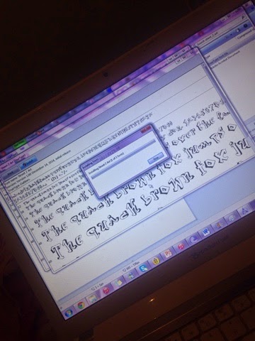
I wanted to show from the appearance of the blog it is very similar to the title sequence itself. The title sequence has loads of production companies at the start , this shows that it is a independent youth drama, similar to the film once you enter our blog you are introduced to our banner which has a very urban feel to it, it is in a graffiti like font which demonstrates the youth drama conventions. However when we watch the actual title sequence we learn that the main character is a rich girl who is also quite girly, moreover this is portrayed through the blog as when you start scrolling down the blog the font is more curly this illustrates a feminine and girly feel to it which is a reflection of our main character.