

Sunday, 7 December 2014


Analysis of title sequences
Analysis of title sequences

Title 1: How video games change the world
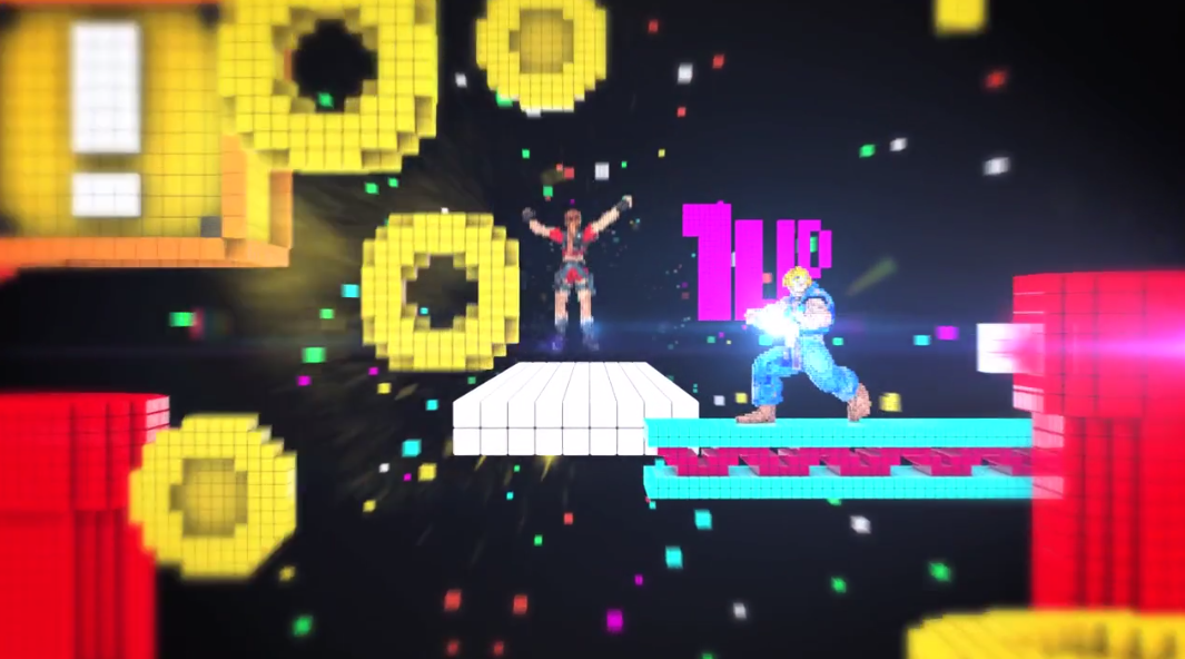
in this title sequence, there is not credits as it is more visual. The font used in this is blocky and pixelated to resemble retro old school video games. We see the title explode out of a star, which represents Mario, and practically covers the entire screen in a bright white colour. Behind this font, small pixelated squares moving from the centre on the screen (behind the text) towards the front in various neon colours pass us, and out of the scene. We also hear digital non-diegetic music which fits the vintage game style. This title sequence introduces all the original retro video games that they claim have taken part of 'changing the world'. I picked this title sequence because it looked like a fun one to talk about and I like it because its very colourful and includes most of my childhood favourites. The director and animator Joe Lea was nominated for an Emmy award for his work on his title sequence 'strike back', produced at Momoco. The music sequence comes from the classic Robocop game for the Nintendo game boy by Jonothan Dunn.
Title 2: The Sopranos (1999)

Title 1: How video games change the world
in this title sequence, there is not credits as it is more visual. The font used in this is blocky and pixelated to resemble retro old school video games. We see the title explode out of a star, which represents Mario, and practically covers the entire screen in a bright white colour. Behind this font, small pixelated squares moving from the centre on the screen (behind the text) towards the front in various neon colours pass us, and out of the scene. We also hear digital non-diegetic music which fits the vintage game style. This title sequence introduces all the original retro video games that they claim have taken part of 'changing the world'. I picked this title sequence because it looked like a fun one to talk about and I like it because its very colourful and includes most of my childhood favourites. The director and animator Joe Lea was nominated for an Emmy award for his work on his title sequence 'strike back', produced at Momoco. The music sequence comes from the classic Robocop game for the Nintendo game boy by Jonothan Dunn.
Title 2: The Sopranos (1999)
When the title sequence begins, the credits shows;
Main characters;
James Gandolfini
Lorraine Braco
Edie Falco
Michael Imperioli
Dominic Chianese
Vincent Pastore
Steven Van Zandt
Tony Sirico
Robert Iler
Jamie-Lynn Sigler
Nancy Marchand
Guest starring;
Michael Gaston
Joe Lisi
John Ventimiglia
Jerry Adler
Casting by;
Georgianne Walken
Sheila Jaffe C.S.A
Edited by;
Joanna Cappuccilli
Production Designer;
Edward Pisoni
Director of Photography;
Alik Sakharov
Co-producer;
Martin Bruestle
Produced by;
Ilene S. Landress
Executive Producer;
Brad Grey
David Chase
Created by;
David chase
Written and directed by;
David chase
The order depicts the importance of the role of each person that took part in creating this film. The important characters were shown in the beginning and as the title sequence went on the credits for each persons significance began to fade out, then by the very end, it sprung up again to the creator and writer of the film.
The font used at the end is typeface, but is altered as the word 'the' and 'Sopranos' are different heights and sizes. Also, the letter R represents a gun which can introduce the lifestyle of the main character shown in the scene. We see the font in the middle of the screen where the main character parks up his car and gets out, taking us into the beginning of the episode. Right in this moment, the music says 'got yourself a gun' which tells us what violence is to come later on in the episode.
I picked this sequence because I have heard The Sopranos is really good and wanted to watch the title sequence. I liked it because it was pulled together really well due to the camera, editing, mise en scene and sound. It seemed very genuine and realistic.
Saturday, 6 December 2014
4- Analysis of 2 title sequence
Analysis of 2 title sequences

Which credits do we see & the
order we see them in?
We
see ( in chonological
order):
•Creative
director
•Art
director
•Technical
team
•Design
team
•Additional
art
•Music/Audio
•Theme
song
•Voices
What font type is used for the
title?
Capitals
Bold White
Standard looking
What happens behind the font- what
do we see, who are we introduced to, what sound do we hear?
While the font is appearing on the
screen, it seems to just be floating in the sky. We see the main character, Octodad,
falling from the sky and as he falls from the sky he knocks the letters from
their position. The theme song is playing, the lyrics are describing the main
character.
What do you like about this
sequence, why did you pick it?
It has a simplistic touch to it. Even
though it is simple, it still consists of a lot of graphic work in order to get
it to seem seamless. It also was clearly matching the content of the programme
and was easy to understand.
Other information
It was originally created by a game
developer company called ‘Young horses’.

Which credits do we see & the
order we see them in?
We
see (In chronological order):
•Directors
•Screenplay
by
•Story
by
•Producers
•Excusive
producers
•Animation
supervisors
•Based
on
•Cinematography
by
•Production
designer
•Edited
by
•Music
by
•Feature
animation by
•Co-producer
•Assoisate
producers
•Casting
by
•Cast
•Production
companies
What font type is used for the
title?
•Capital
•White
•Spaced
out
•Thin
What happens behind the font- what
do we see, who are we introduced to, what sound do we hear?
Different scenes of animation from Lego
happen behind the credits. It shows us that the whole film including the title
sequence consists of Lego and Lego is a huge part of the film’s context. We
hear one of the soundtracks being played.
What do you like about this
sequence, why did you pick it?
I like the fact that the Lego theme
continues even through the title sequence. Even though the Lego is constructed
in different ways it still manages to broadcast everyone's participation
evenly. The soundtrack also has a family oriented sound to it, it is suitable
for everyone and matches the target audience.
Other information
It was made a year before the actual film
because they wanted it to be well made.
Subscribe to:
Posts (Atom)